Sports App.
A sports app with a fresh, unconventional look, where every screen feels different and still easy to use.
- Role
- Visual design
- Field
- Sports
- Platform
- Mobile app
The brief
Build a sports app that looks like nothing else, without making it harder to use.
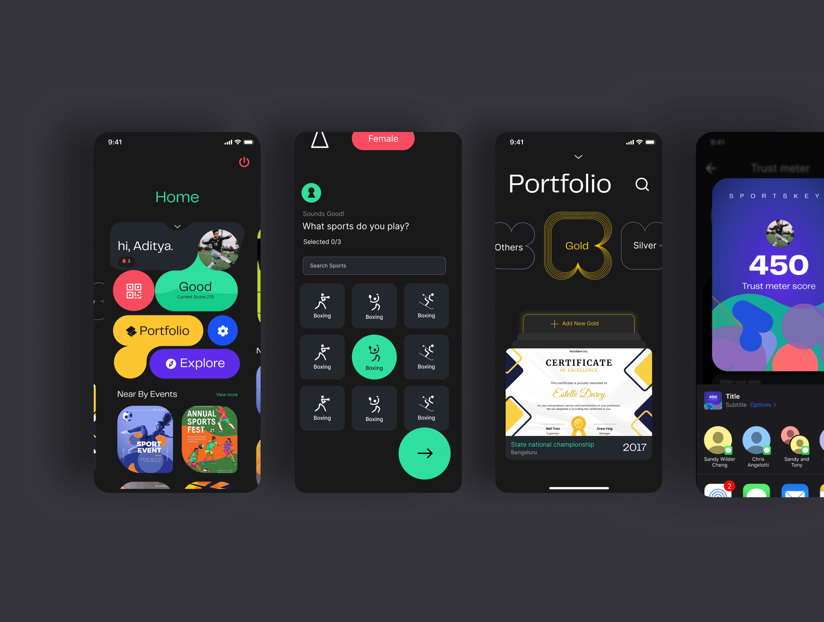
People use the app to browse events, keep their profiles and portfolios up to date, and show a QR code to get in. The client wanted bold, unusual shapes, and a distinct experience on every screen.
The process
The work started wide and narrowed down through quick rounds of feedback.
Brainstorming
Team sessions to explore as many directions as possible.
Research
A look at competitor apps and what users actually prefer.
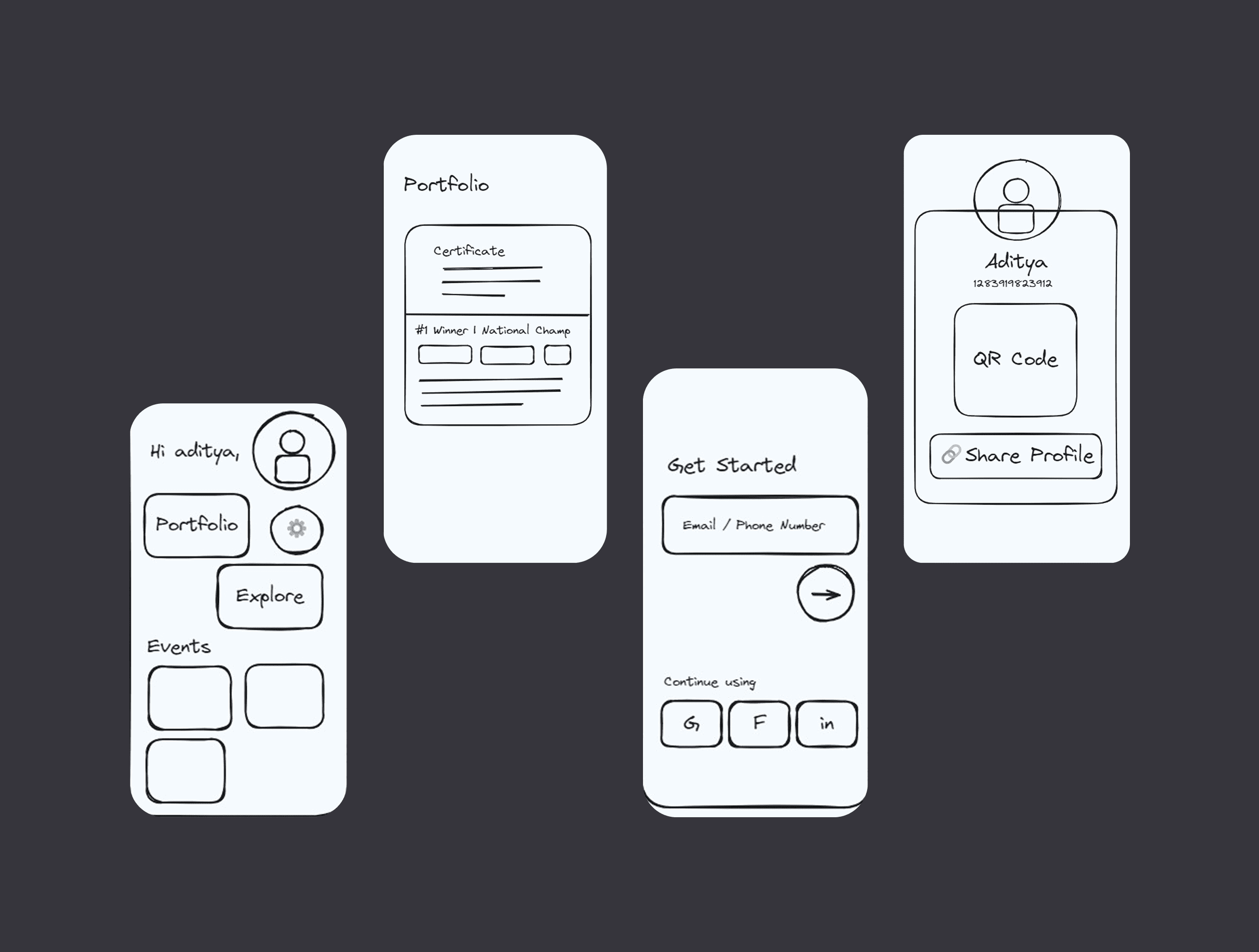
Sketches and mood boards
Quick visuals to test the unconventional shapes early.
Prototypes and feedback
Iterating with the team until the ideas fit both the client’s goals and users’ needs.
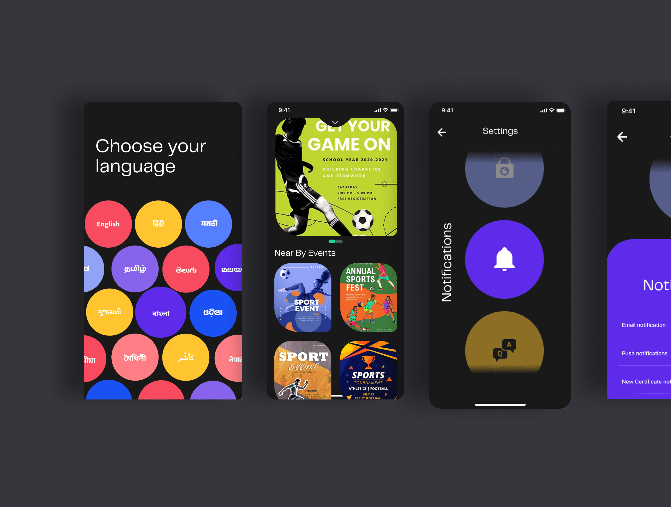
Every screen different. Every flow familiar.
Key decisions
Bold, unconventional shapes
The client wanted an identity that stands apart from every other sports app.
Familiar places for core actions
Screens could look different only if moving through them stayed predictable.
What mattered
Creativity, uniqueness and usability, kept in balance.
The shapes gave the app its identity. Keeping the core actions in familiar places made sure that identity never got in the way of finding an event or showing a QR code at the gate.